2: Invoking Gre
3: Gre Grammar
4: Commands
5: Cookbook
6: Hints
7: History
8: Plans
9: Concept Index
5: Cookbook
- Example 1: Filled-curves, dots, line-segments
- Example 2: Curves, arrows, labels
- Example 3: Color-coded dots, isopycnals on TS diagram
- Example 4: A cmd for TS diagrams
- Example 5: Timing test
- Example 6: Plotting theoretical functions
- Example 7: Map projection
- Example 8: Colored text
- Example 9: Month-of-year timeseries
5.1: Example 1 -- filled-curves, dots, line-segments
-- to be filled in later --
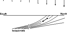
5.2: Example 2 -- curves, arrows, labels
Diagram illustrating x-y curves, arrows, text. Since this is a definition sketch, no axes are drawn. (From Kelley and Van Scoy, 1997)
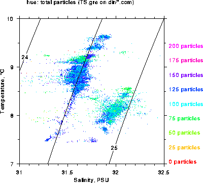
5.3: Example 3 -- color-coded dots, isopycnals
Diagram illustrating temperature-salinity plot, color-coded for a third variable (in this case, bug counts). Data from bioness tows made by Dalhousie as part of the OPEN program.
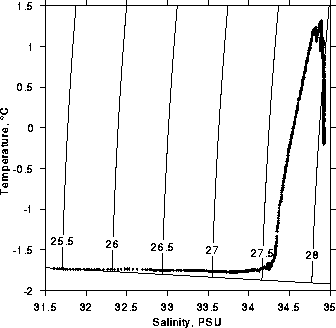
5.4: Example 4 -- a cmd for TS diagrams
The `cmd' created in this example draws TS diagrams, setting up
axis names and drawing isopycnals automatically.
5.5: Example 5 -- timing test
The following code tests the speed of programming a subroutine in gre,
compared to using a builtin function. To run it, do e.g.
`time gre test.gre', then change the comment in the lines inside
the loop, to use either builtin code or the user-defined function.
Depending on the speed of your machine, you may have to use a different
value of `$n', in order to get times long enough to compare, using
the unix `time' program. Also, you may wish to duplicate the
function call a few times, to see whether the loop overhead is
significant.
My results, on a Sun Microsystems solaris machine, indicate that the
gre-based `my_sinh' subroutine is 3.6 +/- 0.1 times slower than the
internally coded `sinh' subroutine. Because sinh is a slow
function to calculate, the loop overhead is negligible -- that is,
increasing the number of calls to the subroutine inside the loop changed
results very little.
   # Test of timing
   sub my_sinh ($) {  # hyperbolic sin
       my $y;
       $y = exp($_[0]);
       return ($y - 1 / $y) / 2;
   }
   $n = 10000;
   $dx = 1 / $n;
   for ($x = 0; $x < 1; $x += $dx) {
       # Uncomment one of following two lines
       #$sy = my_sinh($x);
       $sy = sinh($x);
   }
|
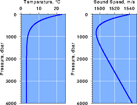
5.6: Example 6 -- plotting theoretical functions
Diagram from my introductory Physical Oceanography class, illustrating (a) large fonts and pretty colors, suitable for overhead projection and (b) display of theoretical curves as oppposed to data.
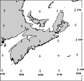
5.7: Example 7 -- drawing a coastline map with fancy projection
Diagram shows Maritimes provinces of Canada, plotted using the
`set map projection' command with Lambert
Conformal Conic projection see Set map projection.
5.8: Example 8 -- colored text
Face it, people like/hate to be reminded of their age on birthdays. So,
the way to make them like/hate you is to wrap their present in paper
that was generated as below. Only a snippet of the 8.5x11" output is
shown. Click on the diagram to see the source code, and just change the
`$year = ...' line to customize for your friends.

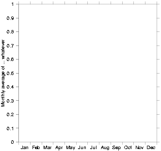
5.9: Example 9 -- month-of-year timeseries
There is no builtin facility for plotting against month-of-the year, but
you can get this sort of graph pretty easily. For daily data you'll
need to know the number of days in each month (as a function of whether
it's a leap year or not), etc. But for month-averaged data, the case is
simpler; you just need to write `Jan', `Feb', etc, along the
x-axis. The following example assumes that the January data will have
x-value of 0.5, the February data will have 1.5, etc.
(c) 1997-2000 Dan E. Kelley, email Dan.Kelley@Dal.Ca